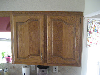
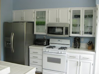
I am super excited about redoing the hall bath because it's the second most used room in the house next to the kitchen. This is the bathroom my husband uses and we use it to bathe all 3 kids AND it's the bathroom that all our guests use.
Here's what the bathroom looked like when we moved in. Like my flower arrangement? I did that on moving day. "Must put dried floral arrangement in the hall bath STAT!" Maybe I thought it would distract our guests from the ugliness of the wallpaper?
This is what it looks like now. I will be moving that cross to a more appropriate place first thing in the morning! Not good.
Anyway, here's the view of the potty. so gross! Not sure why I didn't put the seat down when I took the picture but it definitely makes for a better before shot. The first thing we did was tear off the wallpaper, texture and paint! I don't have an after pic of the first paint job but it was blue. It was supposed to be Robin's Egg Blue but it was gag-me-with-a-spoon blue like hospital scrubs blue or cheap blow-up swimming pool blue. So about 2 years later we painted it a neutral tan that I still like today. Surprising, I know!
We also, installed ceramic tile, a new pee-stain free toilet seat, removed the hanging chain light fixtures and replaced all the bronze hardware with brushed nickel knobs and pulls. And we removed the louver doors and framed in the doorway to make it feel more open.
Here's a crappy picture of the color and a mess of our towels. The first thing we need to do here is "Towel Management". There are a lot of people that use this bathroom so we need to figure out a better system with wet towels because obviously this towel bar isn't doing the trick. So that's first on the list.
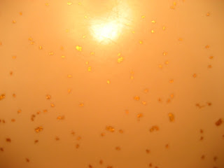
Second is a new counter top and sink. The counter top is white with gold flakes sort of like Goldschlager but not as tasty. Or fun.
I bet when they put this in they thought they were all fancy with their new gold flakey countertop. So I've been shopping around and I think I might be able to get a nice solid piece with an integrated sink without having to sell my first born. Yay! Or should I say "yeeehawww!". Because y'all know that's how we talk down here. Not.
Anyway, I would also like to paint the cabinet black and frame the mirror just like Kate did here.
Isn't Kate freakin' awesome! Go over and tell her "howdy" for me. And then come right back, OK? Go ahead I'll wait.
Wednesday, January 19, 2011
Home Goals for 2011: Hall Bath
Labels:
before and after,
House Tour
Tuesday, January 18, 2011
Home Goals for 2011: Living Room
We've accomplished A LOT in the living room since moving in 11 years ago. This is what it looked like when we moved in. Notice the ceiling fan and separate light fixture? Not sure what they were thinking here. Also notice a very tired brother-in-law sitting on the floor. He helped us move in on that very hot and humid day.
Here's the fireplace view. The first thing I did to this room was remove the 20 year old drapes and shades off the french doors. By doing so it let in tons of natural light and made the room look tent times bigger. OK, maybe not 10 times bigger but a lot bigger, OK.
Here are the built-ins we painted Herbal Wash by Sherwin Williams. We also replaced the wood shelves with glass to allow more light to pass through and brighten up the space.
So what do you think of my goals for my living room? Any suggestions??
Next Goal: Hall Bath
And this is what it looks like today. We painted the wood paneling, installed a ceiling fan with a light and installed hardwood floors. I would really, really like to get rid of the massive TV cabinet. It's entirely too big for the room and I know my husband would really like a flat panel TV on that wall. But I think they're like a billion dollars for the size he wants so we will see about that. (Don't worry, I already removed the fake tree and the baskets on the armoire!)
I would also like to paint the wood trim around the top of the paneling to make the wall look taller and more cohesive instead of broken up. I may even scrape off the popcorn texture at the top of the wall but I hear it's messy and time consuming so that will have to be a day when I'm feeling super inspired!Here's the fireplace view. The first thing I did to this room was remove the 20 year old drapes and shades off the french doors. By doing so it let in tons of natural light and made the room look tent times bigger. OK, maybe not 10 times bigger but a lot bigger, OK.
Here are the built-ins we painted Herbal Wash by Sherwin Williams. We also replaced the wood shelves with glass to allow more light to pass through and brighten up the space.
The first thing I would like to do is beef up that skinny orangey oak mantle so I can actually put things on it without them falling off. Seriously, it is so skinny I can barely put a candle on it without the edge hanging off. Plus I don't think it really goes with the style of the house. I'm thinking something a little manlier like this would do the trick.source: unknown
Here's the other side of the room. We've had this same setup for a while now except for the new lampshades and area rug so it's time for a change! I'm thinking some new artwork and new pillows for the sofa to add a splash of color and personality. Plus, I think the black side table on the left is a bit small for the room so I'm on the hunt for something a little chunkier. I'm also thinking a grouping of mirrors over the sofa might be a good idea to help reflect some of the natural light coming in from the french doors.
Next Goal: Hall Bath
Labels:
before and after,
DIY,
House Tour,
painting
Wednesday, January 12, 2011
Home Goals for 2011: Kitchen
I finally made a list of my home goals for 2011 and boy are there a lot! So many that I will have to break it down by room. Yeah, there's that many. :)
First up, the kitchen.When we bought our home in 2000 it had not been updated since it was built in the 70's. So we're talking green lanoleum , green wallpaper, oak cabinets, oak paneling (yes, paneling in the kitchen!), and gold flake laminate countertops. I'm sure it was gorgeous in 1978 and perhaps it will come around again but I'm not holding my breath. Thankfully we were blessed with white appliances and sink.
Here's a before picture just to give you some perspective of what we were dealing with.
Check out that wallpaper!
Here's another shot from the other side. Notice the plastic grid lighting on the ceiling....awesome!
So here's what it looks like today. You can see we've come a long way but there's still a lot I want to do.First, paint those ugly oak cabinets. They don't look that bad in this picture but they are really orange-y. Gag. I would like the cabinets flanking the sink to have glass doors.
And lastly, I thought about doing this chalk board design on our pantry door but I'm not sure how to go about it. Any suggestions on how to get that curvy shape up top??
First up, the kitchen.When we bought our home in 2000 it had not been updated since it was built in the 70's. So we're talking green lanoleum , green wallpaper, oak cabinets, oak paneling (yes, paneling in the kitchen!), and gold flake laminate countertops. I'm sure it was gorgeous in 1978 and perhaps it will come around again but I'm not holding my breath. Thankfully we were blessed with white appliances and sink.
Here's a before picture just to give you some perspective of what we were dealing with.
Check out that wallpaper!
Here's another shot from the other side. Notice the plastic grid lighting on the ceiling....awesome!
So here's what it looks like today. You can see we've come a long way but there's still a lot I want to do.First, paint those ugly oak cabinets. They don't look that bad in this picture but they are really orange-y. Gag. I would like the cabinets flanking the sink to have glass doors.
Kinda like this.
Next, RIP OUT THAT UGLY WALL RADIO! Yes, it works and yes, I listen to it but it's ugly so it must go! side note: when I was a kid I thought people who had built-in radios in their home were rich! ha ha ha!
So dumb, I know!
So dumb, I know!
Next, install recessed lighting in the breakfast area. I'm thinking this will make the ceiling appear higher, yes??Mess? What mess?
Next paint those walls a darker taupe color to contrast with the soon-to-be-creamy white cabinets. So I'm imagining it will look something like this.....source: Isabella & Max Rooms (I think)
I will be using a scrubbable paint instead of the current flat paint that refuses to let go of dirt when you wipe it! You can't tell from the photo but the walls are covered in tiny bits of food thanks to two little 18 month boys that like to have daily food fights. What was I thinking? Oh yeah, I painted it "pre-kids". Ah grasshopper, you are learing!!!And lastly, I thought about doing this chalk board design on our pantry door but I'm not sure how to go about it. Any suggestions on how to get that curvy shape up top??
So what do you think of my kitchen goals? Any other suggestion for this room?
Think I can "get 'er" done before 2012 gets here?
Next goal: Living Room
Subscribe to:
Posts (Atom)